
MyRide901
UX Audit for
Toronto-based client
MyRide901
See their website: MyRide901
Industry: Vehicle services
Timeline: 4 weeks—September-October 2023
Platform: Mobile native app
Tools: Figma, Figjam
-
The team consulted for this Toronto-based startup, providing a comprehensive usability review of their current app.
-
My Role: Team lead with two other designers:
-
Yoonha Roh
-
Samantha Martinez
-
-
My primary responsibilities:
-
Heuristic Evaluation
-
Wireframes/Prototype
-
-
Supported:
-
Prioritized Findings
-
Style Guide
-
The Opportunity:
From MyRide901.com:
“It should be easy to find, organize, and access your vehicle’s history. So we developed a solution: MyRide901 helps you keep track of your vehicles’ repairs, maintenance and modifications on a timeline that’s accessible anywhere, anytime from one, easy-to-use mobile app.
We believe there shouldn’t be barriers between vehicle owners and the work performed on their vehicles.”
MyRide901 has been on the market for over 2 years, but the team hadn't had the chance to conduct any formal usability testing.
Our job as a design team was to audit the app’s usability and provide actionable recommendations for future development.
-
We provided both
-
Big Bets (dramatic restructuring), &
-
Easy Wins (low-effort, high-payoff) recommendations to invigorate their product roadmap.
-
Taking into account the business needs of the client, we suggested changes that altered the present design as little as possible, making implementation more feasible.
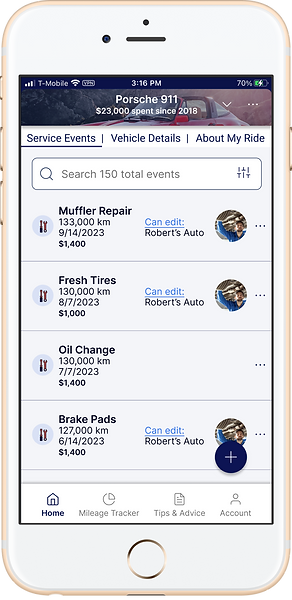
Big Bet: Home Screen Redesign
Current App Design

“Wow. This is great. Now I won’t forget when I had my tires rotated. Tips & Advice? Oh cool, it's a blog.”

“Hmm. What’s this in MyToolkit?
Darn it. Looks like I'll go get my VIN after all.”

“When exactly did I replace that exhaust pipe? Not sure. Better make this date range wide.”

“I took some good notes back then. Let’s send them to the mechanic on the Share tab.”

“Is this the home tab? Where are the events? Oh, it’s a different tab. Well this is handy stuff.”
The service events appear on 3 of the 4 tabs, and the top half of the Home and Vehicle tabs are very similar.
How could these tabs be combined to reduce redundancy while preserving all the functionality?
Proposed Home Screen Redesign

“Nice. Now I can search and share right in the same tab. Lookin’ good in the photos too.”
“I can swipe right to see Vehicle Details and About My Ride. Oh, the mileage tracker is right in the tab bar. Good. I use that a lot.”

“Where’d the other MyToolKit stuff go? Whoa! Neat and tidy!”
I used as much of the current design as possible (including screenshots of their current pages), and incorporated familiar menu patterns to simplify.
All 4 tabs from the current design are simplified to this one home screen. Sharing and other functions can found in the discreet ellipses menus at the car or service event level.
Try it out.
Easy Wins
This proposed home screen redesign would be expensive for the MyRide901 team to implement, as the founder Victor explained.
The team’s developer, Mykyta, gave us further insight into the sorts of recommendations that would be most valuable.
At this stage in their product life, they needed easy wins to deliver big results without a ton of outlay.
Easy Win #1: Onboarding Instructions
Current App Design
Instructions added
CTAs updated

“Which one is advisable? Which do I prefer? Well, I don’t have my VIN, so I’ll just use one of the other two.”

“Yeah, if I'm going to do this right I might as well get it all now.”

“Sync recommended service? That sounds useful.”
While altering the present design as little as possible (easy win), the user can get some clear direction that will improve the onboarding experience and even increase excitement about getting to know the app’s features from the outset.
Easy Win #2: Avoid frustrating mistakes in adding Service Events
Current App Design

“...Zero, zero, zero.”

“Next, please.”

“Darn it! I wasn't done adding info to that service event!”
Proposed Changes

“Next, please.”

“Ah yes, the last step. All done.”

“Successfully added. I like that.”
One of the most frequently used features is adding service events. The current UI is a booby-trap of frustration. The main CTA “Save” cuts short additional information you might enter about the service event.
Adopt familiar keyboard conventions and make the CTAs unambiguous.
Before we go any further, let's wind the clock back for a minute.
Backstory
This was the final project of the Springboard bootcamp, the Industry Design Project, in which a team of students is paired with a client.
I didn’t know ahead of time who my teammates would be, neither did I know the client.
It was a joy to meet Samantha and Yoonha before our first official call
with the client. We decided I would be the team leader (Team YAS!), which on paper meant that I would communicate on behalf of the team with the client.
Our first call with the founders of the company Aysha and Victor (hereafter A&V) got us up to speed on where their app has been and where they’d like to take it. At their original launch the app was a paid subscription. Recently they changed to a free model, running discreet banner ads that don’t compromise the user experience.
They are ambitious and on a roll, and aiming to achieve market stickiness.
Getting into gear with new acquaintances in such a compressed timeline posed its challenges. We had to quickly read each other’s personalities and figure out who would be good at what.
After our first call with the client, I drew the diagram below to help the team start talking and delegating responsibility.
The best laid schemes...

Referring to the colorful pencil diagram above, after completing the Prioritized List, I had envisioned the drama would unfold neatly along three tracks to accomplish the 5 primary deliverables.
First, Samantha, resident Journey Map expert, would get that in the bag. (Which she did. Excellent.)
Second and third were two independent tracks— low- & high-fidelity.
The low-fidelity frames I built would address proposed changes to the app’s structure and flows, while concurrently and independently Yoonha's style guide would address UI concerns we had identified.
Then when we had run tests and iterated on the low-fidelity flows, we could select some key screens to build out in higher fidelity to demonstrate and incarnate the style guide.
Process: Research
Three Pronged Research Attack
1. Usability Testing
Samantha spear-headed getting the testing organized, and each of us recruited for a few test sessions each.
All of our test participants graciously agreed to Zoom in from their mobile phones, having already downloaded MyRide901. That way we could see and hear in real time their reactions to the use cases we presented to them.
2. Competitive Analysis
Yoonha came through like a champ and presented A&V with a very detailed and thorough competitive analysis chart. Enthusiastic reception. Awards and promotions conferred.
3. “Expert Heuristic Analysis”
This thing of weirdness I acknowledge mine.
Using a document layout and process I had invented during my last project, I had begun to screenshot MyRide901 straight out of the gate about a week before we had our first call with A&V.
While I had originally meant this to be just a way to get a grip on the app myself, I immediately realized this could be a valuable deliverable because of the ability to leave comments on minute and detailed issues I ran across.
Considering I had never used the app before, the screenshots and comments represent a frame by frame frozen in time usability test.
Heuristic Analysis Figma Page
(Click to open Figma file)

Detail

Process: Synthesis
Thank God for Figjam & Zoom, eh.
Team YAS! got together over a Zoom call and ironed out our various interviews and research in an affinity map, then organized our notes in a rough Prioritization Quadrant in Figjam.
This chart was useful for us getting organized, and we teed it up to be a great tool for the client as they move forward. We delivered these findings in type document form as well, but the chart is easy to modify and reshuffle as the situation unfolds and priorities change.

The best laid schemes...
Go often awry…
Well they didn’t go too far awry. We just had to keep a sharp eye on our tight deadline and reign in and refine our original ambitions so we could bring the plane down for a nice smooth landing.
Instead of a large series of grayscale, low-fidelity frames, a few of which would later don the dress of high fidelity visual design, the first draft wireframes evolved stage by stage into the high-fidelity frames that we would end up delivering.
Instead of an independently built style guide that would clothe the lo-fi wireframes in brand-new garb, much of the style guide was simply a laying out of the styles I had built into the Figma file as I built and tweaked the wireframes.
Conclusion:
At the end of the timeline, our user interviews, competitive analysis, and heuristic evaluation had been condensed into a prioritized list of recommendations.
These recommendations were manifested in the following ways:
-
Prioritized Findings Chart
-
Style Guide
-
Journey Map
-
Wireframes
-
Final Report PDF
In our handoff call, Victor offered us fresh UXers a lot of encouragement about the value we had delivered and how it would take quite a while to process and incorporate our work into their product roadmap.
What I learned:
Process details:
Figma's version history is great. However, when iterating drafts of wireframes using components, copy and set aside drafts and detach the component instances so the draft won't surreptitiously morph when you're working on the components elsewhere.
Usability Testing:
My teammates and I brought different sorts of things to the affinity mapping that we did, so getting a different angle on the sorts of things to look and listen for was a great learning experience.
Communication:
Considering this actually was our first rodeo, the team had some halting, shuffling communication at certain points. It would take a bit more practice as a team to really get a well-oiled machine going.
Leadering:
The role of team leader was narrowly defined on paper, and in practice it didn't have long enough to really come into sharp relief. Even though I wasn't anticipating disproportionate influence in the team, it seemed to me that my teammates were sometimes looking for my direction to begin tasks. That took some grappling on my end. How could I communicate a vision in an actionable way? Fully appreciate and draw out my teammates' awesome ideas?
Final anecdote:
Towards the rapidly approaching deadline, I realized an important aspect of the Style Guide hadn't been properly addressed, namely, that certain recommendations had not been manifested in use cases. Well, the dream team did some downshifting and tire squealing, and raced into action.
Samantha diverted her lazer gaze to the Final Report, summarizing and consolidating the work of the project into a neat package with a bow on top. Meanwhile, Yoonha and I finished forging and fashioning use cases demonstrating type styles, proper use of contrast, button size, and colors. Also a neat package with a bow on top.
We came in under the wire in fine style. Teamwork makes the dreamwork.
And Aysha and Victor, you know I'll be watching for updates.