
Akabane Bikes
Conversion Optimization

Mobile Website Design: Conversion Optimization
Student Project
My Role:
I was a team of one, responding to my fictional product manager.
UX Research
UI / UX Design
Prototyping
Usability Testing
My final deliverable is a prototype which briefly simulates solutions to the e-commerce optimization tasks I received, and an additional concern that my research emphasized.
Timeline:
June 15 - August 1, 2023
Outline:
-
Product Manager Directives
-
The Discovery
-
Responding to the Product Manager
-
The Solution
-
The Process
-
Reflections: What I Learned
To kick off this e-commerce website project, my product manager sent me his concerns about our company website.
1/6:
Product Manager Directives
-
Akabane Bike’s Mobile Website:
-
Enhance browsing and checkout experience
-
-
Business Goals
-
Improve the conversion from browse to completion of checkout to increase revenue on the product’s mobile-web experience.
-
-
Product Manager’s concerns:
-
Browsing not leading to items in cart
-
Product comparison difficulty
-
Cart abandonment at registration page
-
All right, Mr. Product Manager. I hear you. Let me make a list.
-
Make a product comparison feature
-
Make a guest checkout
-
Make for the door
2/6:
The Discovery
Not so fast.
Have any cyclists been consulted? If cyclists win, Mr. Product Manager wins. How do they explore the market? How do they make their final decisions?
Rider Interviews
I asked cyclists about their experience riding and shopping for the bikes they owned, and then I had them walk me through and give their impressions of Trekbikes.com, the very large and elaborate website of the top US bike brand.
Two basic user types emerged, the beginner and the experienced. Shocking, I know. But they have very different shopping tendencies and needs in the world of bicycles. More on that in a minute.
Local Bike Pro Interviews
My interviewees stressed the importance of their in-store experiences in buying a bike, so I realized the best way forward would be to talk to bike shop employees. They would have talked with hundreds or thousands of riders similar to the ones I had interviewed. What could they tell me about the beginner and experienced shoppers? How did their own shops’ websites relate to their in-store traffic and to their success as businesses?


The honorable and diligent local bicycle professionals were very gracious in answering my questions. They corroborated my initial interviewees’ tales of the beginner vs. experienced shopper split, and further elaborated on that critical aspect of the bicycle shopping world that Mr. Product Manager hadn’t addressed.
And that is the fact that the vast majority of bike sales occur in person, and not online. Now you might say, “Stay in your lane, bro. Just make the guest checkout like the man said.” But surely an insight so pertinent cannot be laid by.
The young fella at Trek said that he sells around 1,000 bikes a year (wow), only 50 of which are bought online and shipped to his store.
I’m no math major, but that looks like 95% of bicycle sales happen in-store, for this Trek location at least.
(He didn’t have data on how many bikes Trek ships straight to people’s homes. One can find numbers for Trek’s total annual sales, and note that Trek has been a leader in the past decade in optimizing online bicycle shopping. However, insofar as Trek and other companies have been able to become more successful in online sales, they have done so by providing online shoppers with augmentations of the experiences they could easily have if they were to drive down the street and talk to someone.)
The other 3 shops I visited had different business models than the megalithic Trek, but the in-store pattern was even more pronounced. From their angle as local shops, Dash, Providence Bicycle, and Legend have been doing just fine with not many online sales at all for 14, 31, and 15 years, respectively. They all carry top-end brands, and a quick visit to the websites of the top-end brands reveals that they themselves rely heavily on a patchwork of local shops such as the ones I visited. (See Cannondale and Specialized, for example, directing Contact Us traffic to local shops. They also have very sophisticated “find a shop” features with interactive global maps.)
Having had the conversations I had had, I was ready to take an informed look at Mr. Product Manager’s concerns and directives.
The product & comparison pages needed to be designed with both a beginner and experienced shopper in mind.
Beginner Brett
Experienced Everette

Beginner Brett is looking for big-picture direction on the homepage.
What are the categories of bikes on offer? What is the price ballpark? He’s looking at the overviews of categories and products. And he’s much more likely to talk to a store representative before pulling the trigger.

Experienced Everette is more likely to make a purchase online than Beginner Brett.
He already knows which size bike to get (critical knowledge indeed), and he understands the technical specs that are important for the level-up he’s looking to do. He still prefers to buy in person, if he can.
For best practices in the building of checkout flows and product comparison features, I turned to the Baymard Institute.
The project couldn’t incorporate all that could be learned from these articles. The practical, evidence-based directives they give cover a lot of territory.
Read the online research report
I also took a careful look at some of the competition. Bicycles present unique e-commerce concerns, and I referred to these screenshots throughout the project.

I was prepared at this point to get in touch with the Product Manager about our path forward.
3/6:
Responding to the Product Manager
The Product Manager's Concerns:
1. Browsing not leading to items in cart
-
Recommendation: Online shoppers should be made maximally aware of their in-person shopping opportunities.
-
Based on customers’ purchasing habits for bicycles and bicycle parts (namely, that the large majority of purchases are made in-person), online shoppers should be made maximally aware of their in-person shopping opportunities.
-
Based on the 6 interviews I conducted, further investigation of the site’s analytics and other data would be needed to determine the correlation of web browsing behavior to overall purchase behavior. Specifically, one possibility is that the browsing of 7 item pages leads directly to in-store purchases, even if the online cart was never used.
-
2. Product comparison difficulty
-
Recommendation: Product comparison feature. Competitive analysis shows that leading sites Trekbikes.com, Canyon.com, and Cannondale.com have robust and very easily used product comparison features.
-
(While intuitively the value of this feature seems self-evident, further data analysis would be necessary to determine conclusively the correlation of this website feature to online conversion rates. Specialized.com, Giant-bikes.com, and Fujibikes.com are examples of bicycle companies who do not have comparison features on their websites.)
-
3. Cart abandonment at registration page
-
Recommendation: Guest check out.
-
Design choices can fix some of the cart abandonment issues
-
24%: The site wanted me to create and account
-
17%: Checkout process (Frequently the sole reason for cart abandonment)
-
See Baymard Institute: “Reasons for Cart Abandonment – Why 68% of Users Abandon Their Cart (2022 data)”
-
-
(A lot of cart abandonment is unavoidable because of some of the way the cart is used, such as shoppers who are window shopping, saving items for later, or who aren’t ready to buy.
-
Read my full response to the PM
4/6:
The Solution: 3 Key Features
-
Product comparison
-
Schedule a test ride
-
Guest checkout
Please see instructions in the sidebar to enjoy the full prototype.
4.1 Product Comparison
Home Screen
Product Category Page


From the homepage, a shopper trying to find a particular bike will often go straight to the hamburger menu for the family/genus/species approach. To have designed a complex cascading menu would be a worthy trophy, but to keep the focus I chose a simpler path in category banner ads. The bikes are categorized according to their purpose, their intended terrain.
From the category page (or the product page), the bikes can be added to the comparison rack.
Comparison Page
Comparison Page


Both beginners and experienced shoppers find what they need on the comparison page.
"Highlight" and "Show only differences" make the tech specs much more comprehensible.
Sticky bike names, prices, and buttons greatly aid the user while scrolling a tall column of information.
Mobile web pages with narrow columns and a lot of information can quickly become illegible. The two-column design above is passably legible, but three columns would be a bridge too far. In my competitive research, the best product comparison pages for mobile either accommodated, or even had a popover suggesting, that the user turn his phone horizontally, which allowed each of the three columns sufficient room for the text to be legible.
4.2 Schedule a test ride
Product Page
Product Page


Schedule a test ride
Schedule a test ride


Strong calls to action lead to better conversion. Other companies that I looked at didn’t have any strong call to action related directly to test riding, even the ones I confirmed “encouraged test riding.”
I took this as an opportunity for improvement. The main call to action still leads directly towards making an immediate purchase, which the business team would approve of, but the shopper’s imagination is stirred, his appetite whetted with the thought of conveniently getting his hands on the real thing before making the purchase.
4.3 Guest Checkout
Checkout
Guest Checkout


My simple guest checkout simulation showcases a small set of best practices from my research.
Firstly, guest checkout should be the most prominent option. Secondly, to ensure that the shopper is certain he is not making an account, a CTA explicitly selecting “Checkout as guest” is advisable, instead of leading with the field to capture the email address.
The right screen above shows a time countdown rather than saying “before 5pm EST,” for example. The countdown makes the time parameter more immediately palpable and removes the need for the user to make any time zone calculations.
The estimated delivery is expressed as a date range rather than “2-4 days.” This also makes the information more concrete and actionable.
The second screen also makes clear once again the company policy of shipping bikes to local stores. (I offer an explanation of this policy below.)
Checkout: Payment Information
Review your order


Credit card inputs are a minefield of hazards when it comes to online conversion and abandoned carts. Best practices demonstrated above are as follows.
1. Input fields should be in the same sequence as the information appears on the card. Many shoppers enter the information in the wrong fields because they are too closely consulting their card, not realizing a mismatch in the input field sequence.
2. Automatically format the credit card number into 4-digit segments. This makes error prevention and correction much easier than having an unbroken string of 16 digits.
3. Format the security code as it appears on the card. This reduces errors as well.
The screen on the right shows that at the “review order” stage, the shopper should be able to edit any field without going back to a previous page.
There is a lot more to this tricky enterprise than my simple prototype could hope to address, and it was fascinating taking a detailed look at this nitty gritty subject.
5/6:
The Process
5.1 The Blank Canvas
Besides a few lines of text to stand in for a living breathing product manager, I had to invent all of the other parts of the company that would make my designs make sense. Where to begin? Needing to make decisions fast, I accepted my own bike as my guide. It is a Fuji, made in Japan, ergo my own company is from Japan. Akabane’s authorized dealer policy was suggested by Fuji’s model as well.
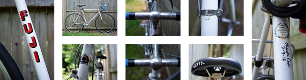
Akabane is a neighborhood in Tokyo. Akabane bicycles take their names from Japanese history and geography.
From the branding mood board
%2C%201885_12_10.jpg)
Color study
5.2 Getting Started
User flow diagrams in the “real world” are often used in more complex or unique technical situations, such as adding a feature to an existing software for example, but completing this exercise for this simple e-commerce scenario was beneficial for my education, early as it is.
5.3 Low-fidelity designs and Early Testing
“Assembled from a UI kit” is the lo-fi strategy I began with. I have not mastered it. It was still hard to not get bogged down in details. What got the ink in the sticky pen flowing was writing words, only words with an auto layout frame at most for detail. I have a lot to practice to speed up this process.
Lo-fi product page
Lo-fi category page


At this low fidelity stage the design’s intention was indicated mostly by placeholder text. The 5 tests I did were very productive in clarifying the best choice of words to match the intentions, among other issues.
The main point of confusion for my testers turned out to be the nature of company policy itself. How was the online experience related to the in-store opportunities? Not having any actual company representatives to consult, I had to invent company policy based on the models I saw in competitive analysis.
The first domino that set off the chain of my company invention was the idea that my company was a small Japanese company just making its way into US markets, and that it had followed the authorized dealer model for strategic business purposes, and wasn’t ready to expand its capabilities to include the complications of shipping to customers directly.
Read the policy: Akabane Company Policy
5.4 High Fidelity Testing & Iterations
High fidelity testing led to further refinement of the website copy and a list of details to increase the users understanding and ease of use. I got a lot of suggestions, but only the most critical were implemented.
The UI needed to be refined, specifically the number of type styles reduced and the button styles made more consistent.
I found that the checkout flow worked very well, and considering it was built based on recommendations from aggregated user testing, I wasn’t surprised there wasn’t too much friction in my simple prototype.
Final thoughts: What I learned
I greatly enjoyed hitting the pavement with some guerrilla interviewing to do. I haven’t had reason previously to interview strangers, and not being a super extroverted person, it took a little gumption. But frankly, I would like to do more of that in the future.
There are established patterns and best practices for e-commerce, but a lot of companies still have trouble with cart abandonment and following the best practices for avoiding it.
Expertly built websites take a lot.
Thank you for reading!
Please see the instructions in the sidebar to enjoy the prototype: